CSS Units Best Practices
CSS has several different units for expressing length. Among them. There are those that fit better between different rendering media and others are good for a specific case. in this article, we are going to list CSS units and give some best practices.
CSS Units
There are two types of length units: absolute and relative.
Absolute Units
The absolute length units are fixed and a length expressed in any of these will appear as exactly that size.
| Unit | Name | Equivalent to |
|---|---|---|
| cm | Centimeters | 1cm = 38px = 25/64in |
| mm | Millimeters | 1mm = 1/10th of 1cm |
| Q | Quarter-millimeters | 1Q = 1/40th of 1cm |
| in | Inches | 1in = 2.54cm = 96px |
| pc | Picas | 1pc = 1/6th of 1in |
| pt | Points | 1pt = 1/72th of 1in |
| px | Pixels | 1px = 1/96th of 1in |
Relative Units
Relative length units specify a length relative to another length property. Relative length units scale better between different rendering medium.
| Unit | Relative to | Base on |
|---|---|---|
| em | Font size of the parent, in the case of typographical properties like font-size, and font size of the element itself, in the case of other properties like width. | Font |
| ex | x-height of the element's font. | Font |
| ch | The advance measure (width) of the glyph "0" of the element's font. | Font |
| rem | Font size of the root element. | Font |
| vw | 1% of the viewport's width. | Viewport |
| vh | 1% of the viewport's height. | Viewport |
| vmin | 1% of the viewport's smaller dimension. | Viewport |
| vmax | 1% of the viewport's larger dimension. | Viewport |
| % | Relative to the parent element. | Viewport |
Best Practices
After going through the CSS units, we'll see which unit is right for a given situation, especially today where developers need to build a website for multiple devices at the same time (Responsive Web Design / Development).
Absolute Units vs Relative Units
As a responsive web designer, always choose relative units rather than absolute ones, unless you want a fixed length for all devices or you are developing for a specific device.
Pixels
Use pixel when the length of the html element or the length of the css property does not need to be scaled according to the size of the devices. A practical example is the CSS border property.
.element {
  border: 1px solid #000;
}
Percentages
Percentages are mainly used for widths specially in multi column layout widths. They make it very easy to calculate the percentage of a parent object's space that a child element should occupy. This is illustrated below.
<div class="wrapper">
    <div class="box small">I am 20% wide</div>
    <div class="box big">I am 80% wide</div>
</div>
.wrapper {
    width: 400px;
    border: 5px solid rebeccapurple;
}

.small {
    width: 30%;
}

.big {
    width: 80%;
}
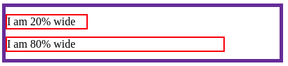
When using percentages for widths, you need to pay attention to the padding, margin, and width of the border, otherwise your element will overflow from the parent element.
You can set box-sizing to border-box to include the border padding and width in the element width. This will take care of the padding and border width, not the margin.
Em
Typically don't use em units for font sizes, except for the lowest possible child elements, to minimize its cascading impact on relative units. Use em units for sizing (line margin, padding, width, height, and height) which should scale based on the font size of an element other than the root.
Rem
Unless you are doing something specific, rem css unit is your best friend. In short, anything that can be made scalable with rem units should be.
Conclusion
There is no Cartesian rule for using CSS units when designing a website. Just use the CSS units and CSS layout to make your content fluid and sized the way you want it to be for different devices. And for this, relative units are more suitable, but if you want a fixed size for different screen sizes, using pixel CSS is handy.